
Hey all!
Wanted to spend a little bit of time talking about something I recently came up with, which is an answer to the question of “How do you display the state of something complex in only 32x32 pixels?”
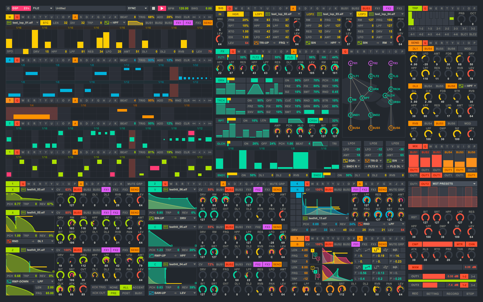
If you happened to look closely to the video I posted here, you can see a little icon appear in the Build tab for the first building I select. It looks something like this:
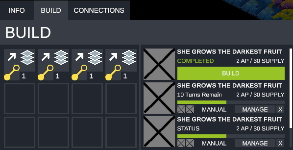
What this panel does is indicate what a given Interactable is able to build. The game will always put possible supply lines at the top, and then start units lower in the grid. So this Interactable can only build supply lines, but this one can build two supply lines and a basic drone unit:
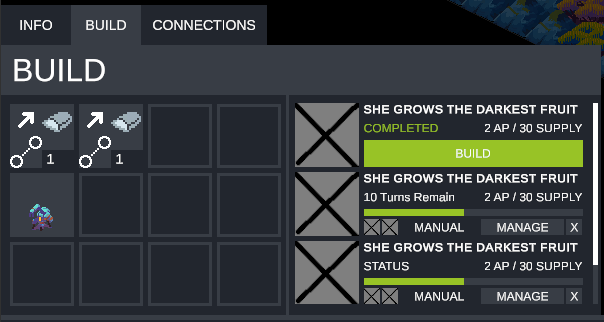
Ideally, you can kind of discren what’s going on with the supply line selection (and a tooltip will help you if you don’t know, I promise). It looks like an arrow pointing out, so it’s likely something going out. What something specifically? Probably that icon next to it (my poor excuse for trying to make “Steel”). So it’s a supply line that makes steel.
But wtf is that icon in the bottom left?
This is what I want to talk about!
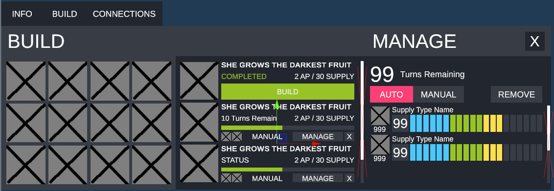
So, a supply line in Cantata can have a lot of different states. Not only can they be connected or disconnected, they can also be interrupted, ready to be built, ready to be upgraded, etc. Before, when I was first drafting this UI, I had made unique symbols for all these states. These looked something like this:
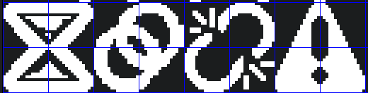
These… aren’t bad! The idea is that you would be able to look at the icon and determine the state of the thing, which is what I wanted, but I couldn’t help but feel like they were kind of dissonant. The hourglass, for example, doesn’t feel “related” to the caution sign, they are separate. The caution sign could also be used for some other thing in the game, totally unrelated to supply lines.
Given that supply lines are their own unique thing in the game, I wanted to instead try and develop a cohesive symbolic language to describe their state at a given moment. So here’s the sticky note where I started:
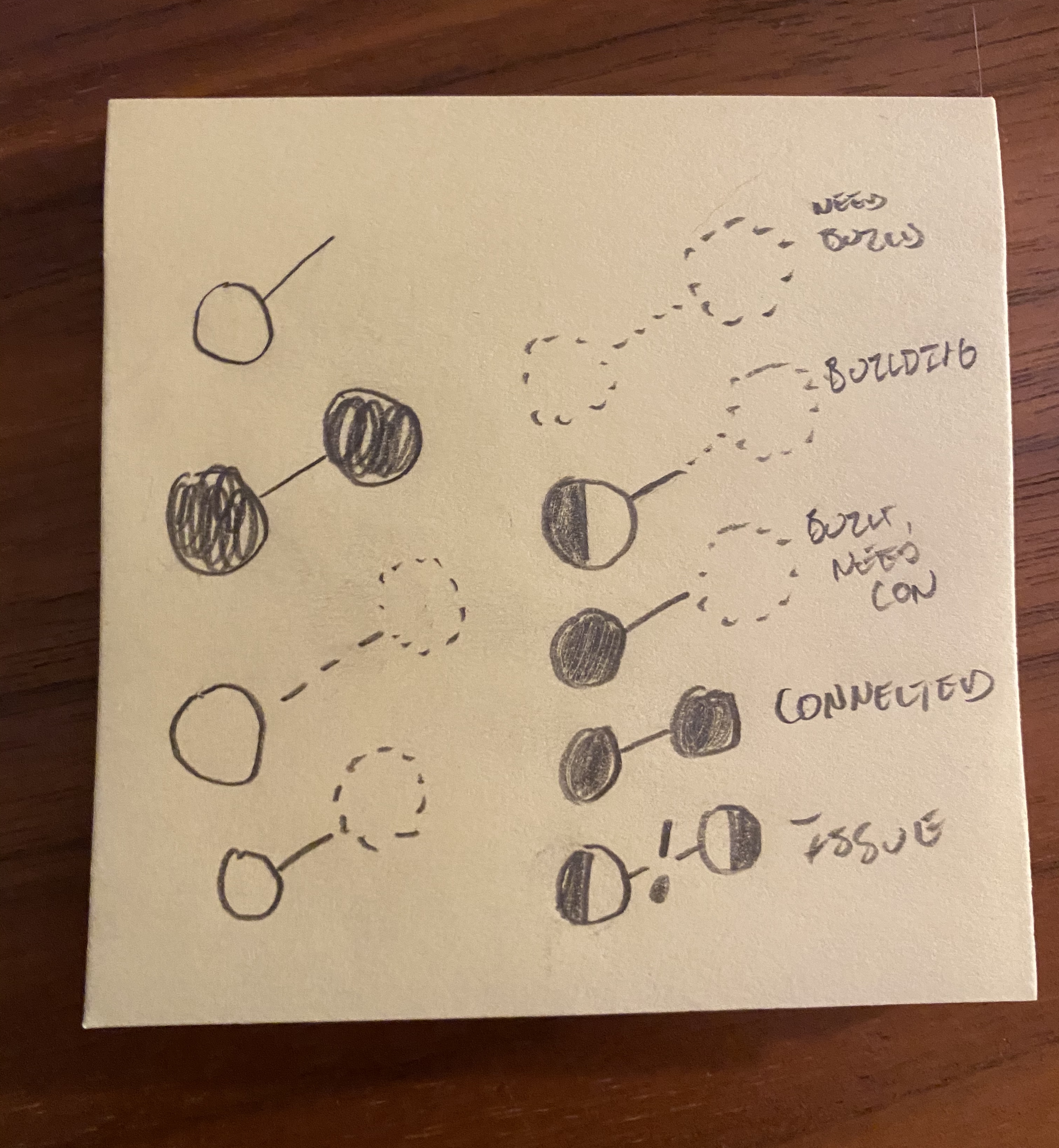
The idea was to use basically the same set of symbols (circles and lines), drawn in a specific way (one circle connected to another), that transitioned between states. I.e. a circle/line could be dotted, outlined, filled in, or half filled in. A circle represents some interactable, and a line is a supply line. Thus, two circles connected by a line implies two interactables connected by a supply line.
It’s worth saying here too that obviously there is a learning curve to any system that uses symbols. I tried to choose something that would be (hopefully) be easier to learn by using simple components, but that doesn’t mean that, at first glance you may not understand. I do have a tooltip that explains what’s going on on mouseover, but, assuming someone is down with learning the symbolic language, my promise to them is that it is consistent and hence can be relied on.
So, lets count the total possible states this system could inhabit. Any given item can be dotted, outline, half-filled in, and fully filled in. That’s 4 states per item, of which there are three, so total possibility of states this can inhabit is 64 ( 4 * 4 * 4). However, if I learned one thing from an information design class I took in college, it’s to try to represent any information shown to a user in at least two ways at the same time. This is a design framework that permeates Cantata, so it made sense to leverage it here as well. Right now, we’ve been assuming that the circles/lines are black and white, but what if we also added color. An outline red circle could be different that an outlined blue circle, etc. That makes the total possible states this could represent effectively infinite (as there are thousands of possible color choices).
But just because we can use every color doesn’t mean we should. Also, the actual size of this icon is only going to be 32x32. For reference, that’s as big as this red dot:
Our eyes also are really bad at detecting differences in the hue of a color, which means that we can’t effectively use every color, even if we tried. I’m very aware of this for Cantata, and has been why, since some of the earliest days working on the game, I’ve tried to adhere closely to a color palette for not only the pixel art (done by CobraLad), but for the UI itself. For every UI element, I’m trying to only use one of a very limited color palette:

If you’re a programmer, you may recognize this as Monokai. It’s a color palette specifically designed for legibility between different elements, and rose to prominence due to the popular code editor Sublime Text adopting it as it’s default color theme. Cantata uses a palette very similar to monokai, but not exactly the same. The colors in the game (and general UI principles) are heavily inspired by this software synth Kickstarted a few years back:
And here’s some current UI for reference:
(Don’t worry, I’ve already talked to the people and they’re aware of Cantata and excited to play  ).
).
All this to say that I’ve been trying hard to make sure the design language in the game is consistent. This extends to the supply status icons, because though they are unique in their application to supply lines only, they obviously need to fit with the rest of the UI as well. If I was going to use colors for the elements, they obviously needed to be the same colors I’ve been using for everything else.
On top of this I narrowed down what states I actually wanted to show with them. Even if I had “only” 64 options for state, that doesn’t mean that I would want to use them all. Trying to remember 64 states for anything is tough, let alone a videogame. So I narrowed down the states I wanted to show for a supply line to just the following:
- Not Built
- Building
- Built, needs to be connected
- Connected, but could be upgraded
- Upgrading
- Upgrade complete, needs upgrade to be executed
- Max level
- Disruption
These eight states more or less capture the full lifecycle of a supply line. You first build the line, then, after you have built it need to connect it. Then that connection could be upgraded, then once it’s fully upgraded it’s max level. You may have a line disconnected, so in that case your line is disrupted.
So, using the above system of shapes and colors, I wanted to show a progression through those states, where more empty/colorless versions of the icons evolved over time into full/colored versions. And here’s what I’ve got so far (where left to right represents states 1-8):
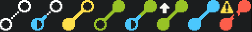
With these icons I’m trying to use the following rules:
- White means “without” in some way. Anything in white needs to be “filled in” in some way.
- Blue means “progress” (in progress, max progress, etc.)
- Yellow means “needs attention”
- Green means “mostly good”
- Red means “issue”.
As I type this now and am really examining this I can see possible places for improvement (maybe 6 needs to be yellow?), but generally I like the framework. Open circles mean that there is something that needs to be done either on the “giving supply” end (lower left circle) or on the “receiving supply” end (top right circle). Half filled circles mean something is being worked on at that end. Here we see states 2 (Building) and 5 (Upgrading), mean that there is something currently happening with that line.
States 6 (Needs upgrade execution) and 8 (Disruption) have an additional icon to indicate the action as a sort of hint. I think I may do more of this for the other symbols as well, because again, overcommunication in game UI design is rarely ever a bad thing.
Going to keep working on this a bit and see what they actually feel like in game, but I really like where I’ve landed generally with the idea! Expect to see these icons a lot once you’re actually playing, but for now, hope you enjoyed reading about how they came to be!
