
Hey everyone!
Wanted to update some people on some work I’ve been doing in addition to some other stuff to just show you a bit of a look into the process of making a game. For a long time I’ve known that I wanted to change up the Cantata UI, and though it never really seemed like the right time to do this work, I took the last few days to put together a mock and some thoughts!
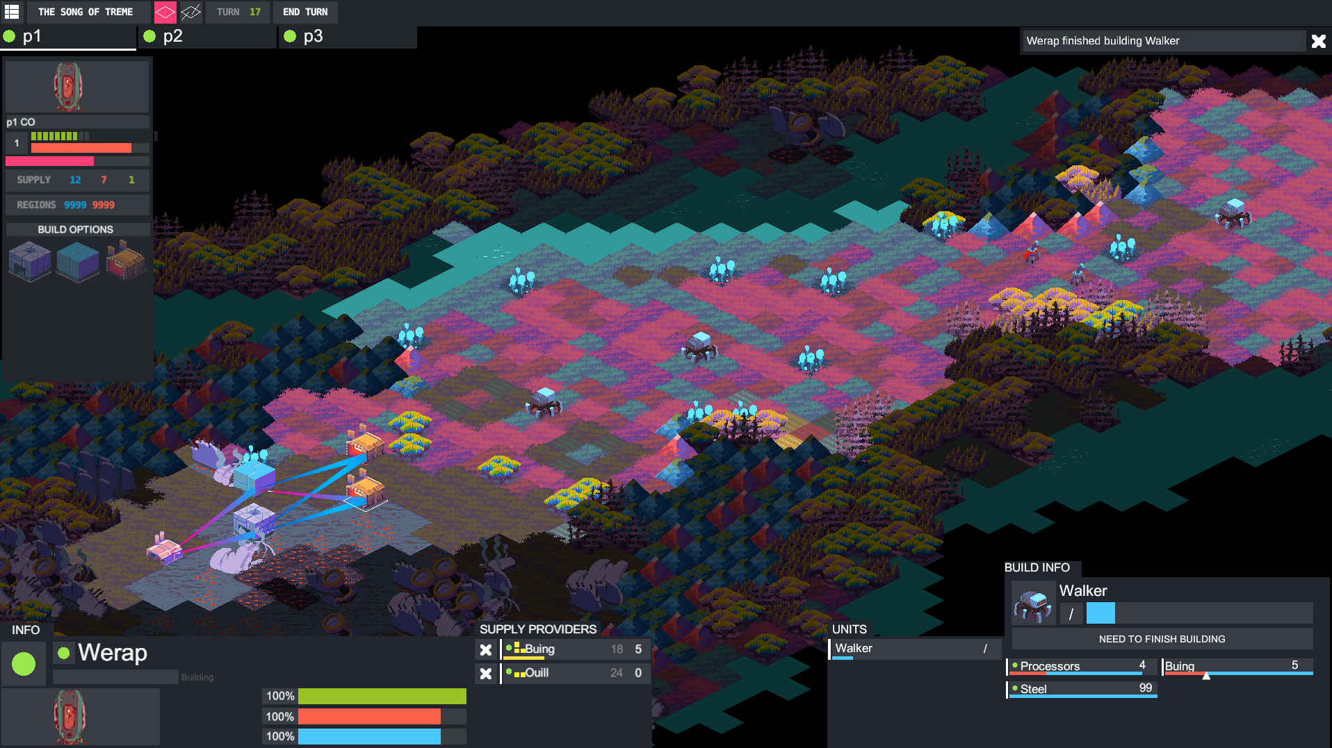
Here’s the current UI for the game. It’s functional, but doesn’t really provide great visibility into what “matters” on a given turn. Additionally, some of the functionality around how it allows you to interact with buildings/units represents an older model for the game. I needed to both make the UI more readable, as well as revisit the functionality of its interactions.
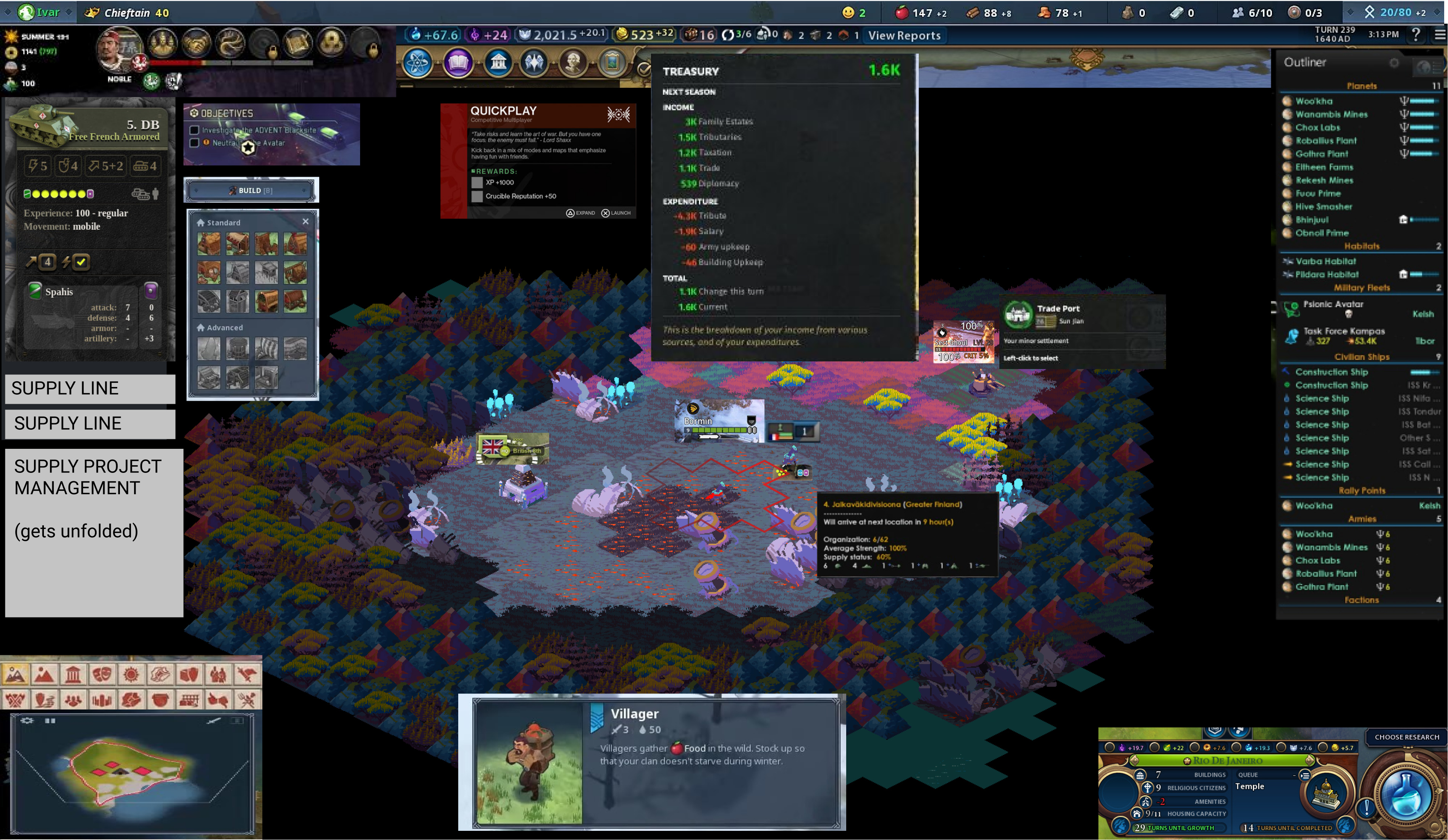
Here’s a first pass. Worth noting that this isn’t like what I want the UI to LOOK like exactly (it’s hella crowded), but just pulling in elements of games I liked and sort of stitching them together as a way to approach building out something new and seeing how those elements I wanted would potentially fit together.
This image is also a fun where’s waldo for strategy game UI. By my count this is using UI elements from 9 games. Can you figure out which ones?
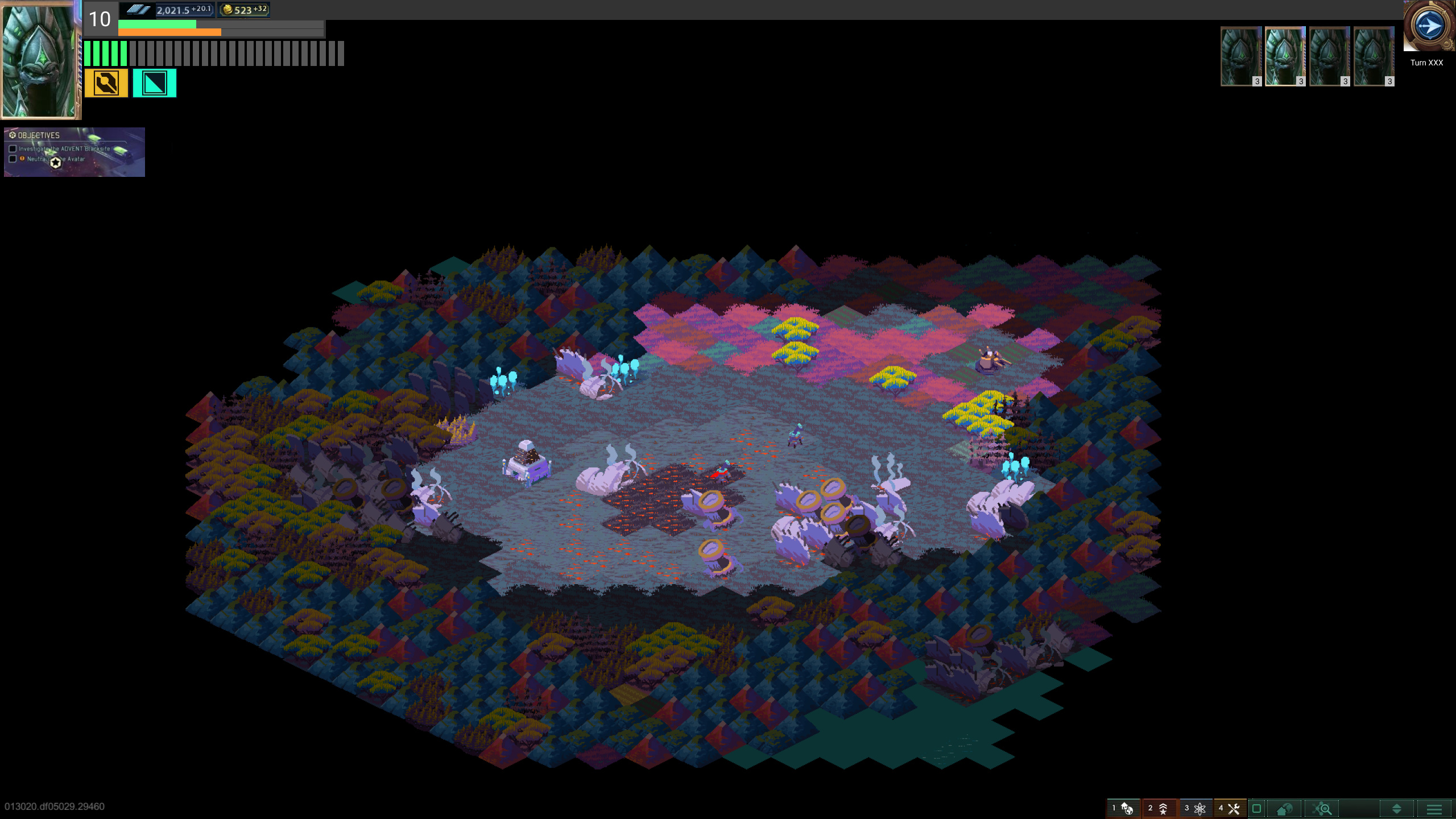
Here’s my first pass at implementing some of the above into a design for the UI that’s actually approaching functional. Things worth noting:
Commanding Officer portrait in the top left designates that portion of the screen to generally manage “Commanding Officer” stuff. That includes its level (“10” number), how much supply the player has remaining (steel symbol), and their progress to a region victory (gold symbol).
It also shows a green bar to designate experience progress, and an orange bar to designate progress for something else. The green tick marks are AP, with the greyed out amount representing AP Max/what you’ve already used.
On the right side, I now show a more prevalent next turn button in addition to commander portraits for other players in the game to show turn order.
Here’s a more “expanded” view. You can see in the top left the yellow/cyan buttons are used for global actions, like building a building on the map. To the right you can see a collapsible paradox-style outliner that I’d really want something like, as well as a collapsible minimap for quick navigation.
In the bottom left we have the newer selected unit UI, which shows you information about your currently selected unit. The portraits here are the same not because this unit is also the commander (though the Commander is on the map in Cantata!), but to just show the portrait location.
I go into it in more detail below
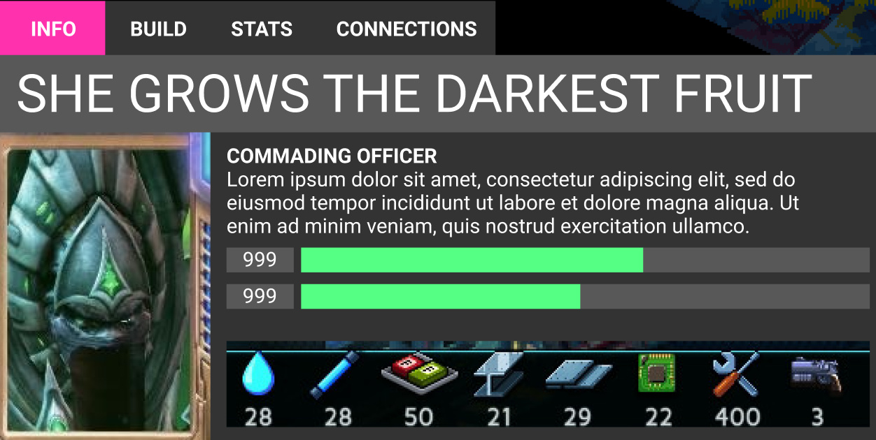
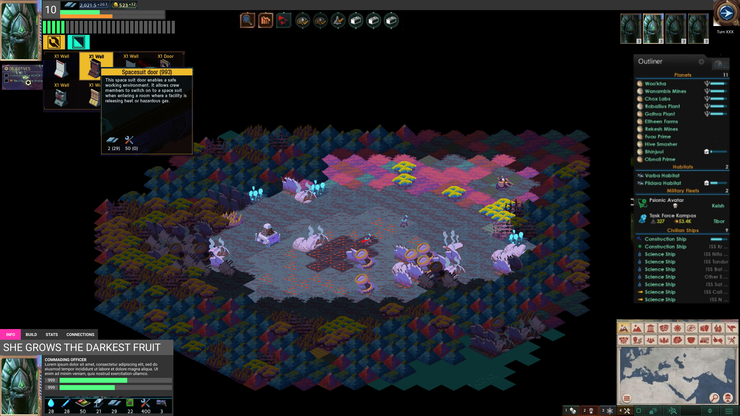
Here’s the selected unit UI up close. You can see the unit’s name and type, in addition to a small description. You can also see it’s health, and a bar for something else I’m not yet talking about.
Under it, you can see what resources it has as income. This says “how many resources/supply of what type does this unit have access to?”.
Note the tabs at the top as well. By clicking Build I can access the build settings for the unit, shown below.
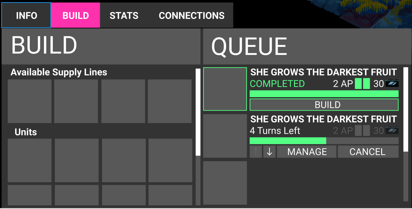
Here I can click to build a supply line I have access to, or build a unit of some kind. When clicked, these go into the build queue on the right side. Queued build items have a priority, and also display the time until the option is done, as well as the ability to change priority (the arrows), cancel the build, or manage. The 2AP/30 section is meant to indicate the deploy cost once you build the item. Aka after I build “She Grows the Darkest Fruit”, it costs me 2 AP and 30 Supply.
By clicking manage I can manage the build manually instead of relying on the priority system. See below.
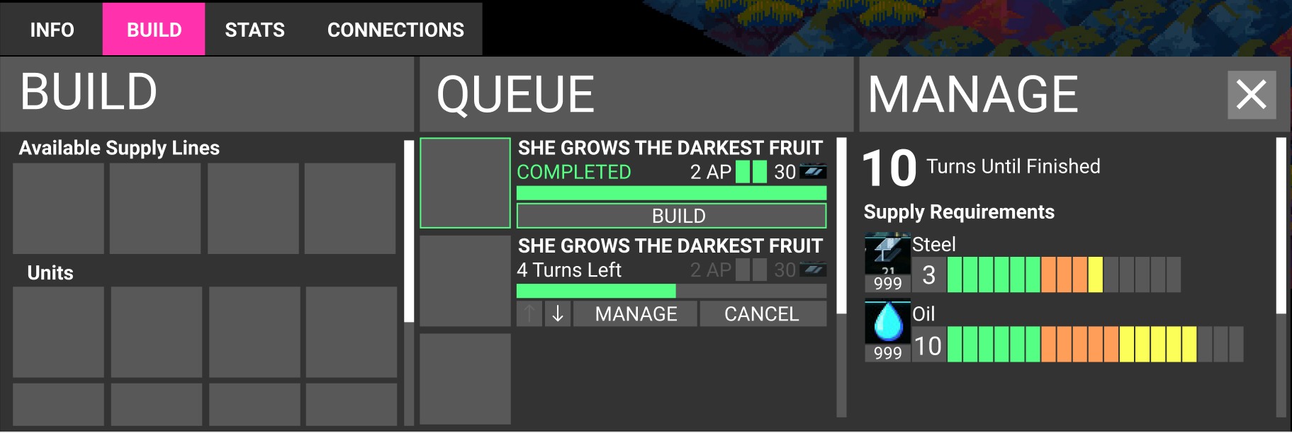
In the popout mange section, I can directly allocate supply types I have access to to change how quickly my option will be built. This is useful if you don’t need things to build as fast as possible, or, due to someone destroying a supply building, you need to reallocate supply to focus on more important projects. You click and drag in those tick marks to change your supply allocation.
The number under the supply type indicates how much supply of that type you have left you can use. The number to the right is "how many turns of supply at this amount will it take for this requirement to be met. The green is the total supply of this requirement type already spent (“progress”), the orange is the staged supply (to be used at the start of next turn), and the yellow is the amount of remaining supply of that type you have access to.
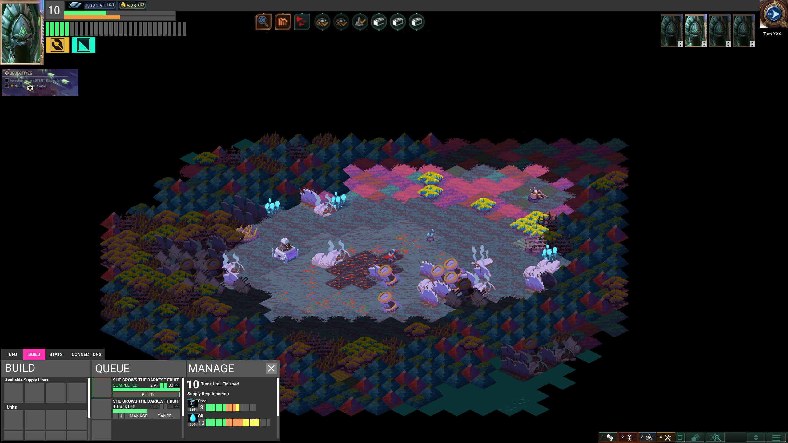
Here’s a more zoomed out view to show you probably the most common configuration you’ll be playing with.
Thanks for reading!