Random Development Nuggets

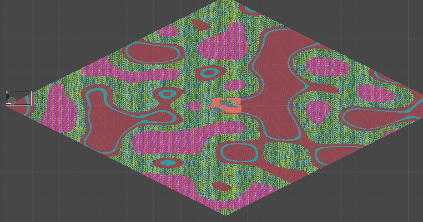
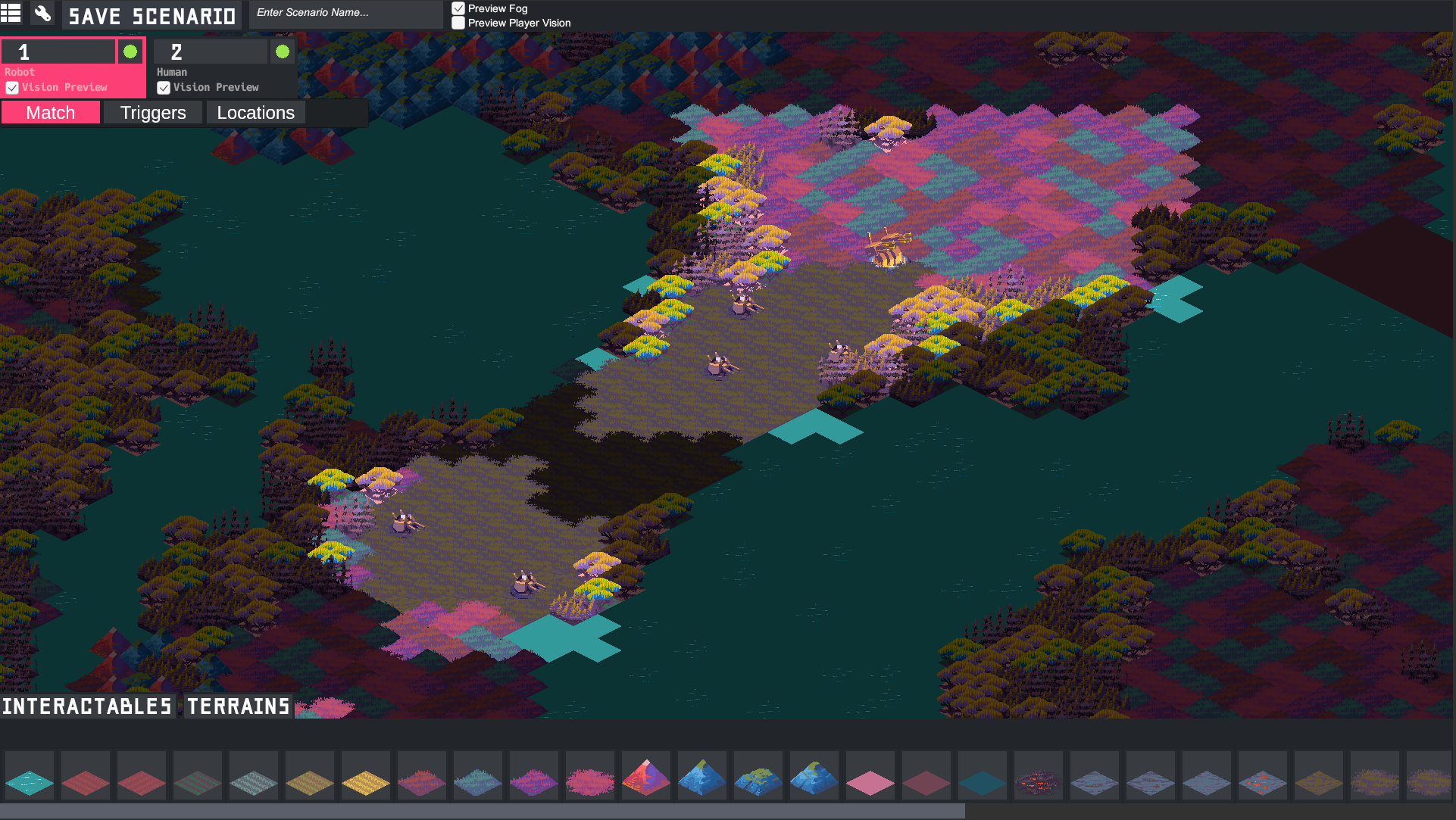
Did not plan on doing this, but spent the majority of the day working on the asset pipeline again! I’ve now made it so you can import 64x64, 128x128, 256x256, or 512x512 spritesheets in to use for Terrains! Ended up being much more of a PITA than expected, but what it unlocks means that it’s much easier to import “single terrains” with a 64x64 image vs. before where you needed a full 256x256 image for even a simple sprite. Aka before you needed something this big no matter what (may be hard to see with white bg):

bog

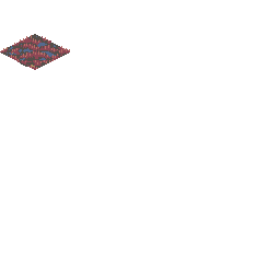
A 256x256 image for only one sprite! And now you can just use this, a single 64x64 sprite:

single64

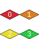
You can also now do 128x128 as well:

quad128

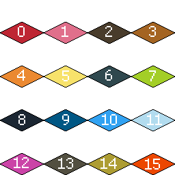
256 is still supported:

debug-master

And you get really big (512x512, or 8x8 sprites) if you have something more complex. More on terrains in general in an upcoming blog post!

Working on adding in definable locations to the game! This means that in the scenario editor you can mark locations as either trigger points, i.e. “Do X when this location is reached” or use it to define regions, which are used for victory point tallying.

Here’s a sample location:

Nice!
Maybe we will have player-created campaigns with the way these mod tools are going!

1 Like

That’s definitely the hope! Ideally we the development team have he exact same tools players get, so any map in the game acts as a way to show what’s possible with the tools!

Working a bit the past few days on polishing up the Scenario Editor. Specifically that meant adding a “brush size” key for terrain editing (sorry for the twitter embed!):

And also making the promise of “really big maps” actually work in practice. This is a typical gameplay view, which shows you about 40 tiles across:

This is very small part of the much large map it was generated on. This map is 512x512

I don’t have plans to make crazy 512x512 maps for the game itself, but I’m leaving the option there for people to to use it if they want! Also nothing is stopping the renderer from doing bigger maps than that, so I may add a 1024 or maybe even 4096 option later for the Truly Insane.

Had a lot of fun this weekend working on terrain brushes:

@nDoJoy Doing some work on general ambience and went with your idea of a tiered FoW system. Right now it’s too aggressive, but this idea of “visited tiles” vs. “visible tiles” is implemented and is SUPER VIBEY:

Looks slick! Floating islands! Hah.

With units having strict true/false vision of tiles within their range, maybe a tiered system for falloff isn’t completely necessary? It might actually end up giving a sight advantage, no? That could be cool, a little preview of the lands you’re about to explore…

Question, is a modifier to sight range one of the aspects that can be attached to units? It’d be super dope to have behemoths that could be seen from over the horizon.

1 Like

Haha yeah the “floating islands” look isnt totally intentional - I plan to make it where tiles are really dark but not completely invisible. Functionally as well that makes more sense because if there is some big terrain you can’t cross you don’t want to see that you can’t go there but can’t see why.

Regarding that visibility modifier, I wasn’t directly planning on it but it does sound cool - I can definitely see some uses for something like that - even as a utility being able to see objectives or something from the start.

Something similar I was thinking of that does need to be in relatively soon is an Aspect that changes the underlying “visibility” cost of a tile. Because you have some flexibility in stacking units (more later!), you could have an interactable that kind of acts like stealth cover to other interactables around it. I’m going to use it in the alpha for something a little less interesting, but no reason some other mod couldn’t do it like that!

Screenshot for the video I posted yesterday on Twitter

Doing some final touches for GDC in adding a lot of quality of life things for actual gameplay!

I’ve added in the ability to preview an interactable’s vison range, movement range (if it can move), and attack range (if it can attack) on hover if you press the correct key. In the preview, movement is blue, vision is yellow, and attack is red. You can also preview this for enemy units as well, which makes figuring out positioning much easier!

Another nice thing I did as allow you to preview your new attackable tiles when you’re looking for somewhere to move (if you can attack). This means you don’t have to do chess moves in your head to determine if you can attack something after moving.

Lastly, I implemented a pretty big feature that has to do with buildable interactables, also known as “Infrastructure”. Infrastructure now has a “buffer” range around it which blocks you from building other infrastructure X distance from existing infrastructure.

This means that you can’t just build buildings all incredibly close together, and forces you to move out an explore more of the map to give you more places to build. Like everything else, this number is also moddable and not hard coded, so it’s also possible for your own interactables to make it so they can build on top of each other.

Nice, looking way more like a proper game now. Dig the map art, why do some of those tiles look like smoking shark heads though?

Rather than having three different buttons/readouts, maybe a single key to highlight all three ranges at once would be more user-friendly? And personally, I like the look of the outlines (eg, the white box around that unit) rather than a highlight, but that might be more headache.

So can we maybe expect an alpha around/after GDC?

Why do some of those tiles look like smoking shark heads though?

It will make more sense once you actually see some of the narrative that surrounds the demo map :slight_smile:

Rather than having three different buttons/readouts, maybe a single key to highlight all three ranges at once would be more user-friendly?

I’ve definitely thought about this but am not sure how you handle stuff like overlap. Like a tile that you can see/move to/attack — if you preview all of that at once it may be information overload. I’ve found so far that I only really need one at a time, but that doesn’t mean I’d rule out a single key. I do also think outlines would be better, but for now the highlight was just the easiest route forward for GDC.

So can we maybe expect an alpha around/after GDC?

That’s definitely the hope! I built this whole map using the in-game scenario creation tools, so I’m hoping to deliver both the map and tools as soon as possible in the next month or so!

Sounds like a good narrative! When I called them smoking shark heads it was in the most positive sense :stuck_out_tongue:

Definitely feel how that could be information overload, and more difficult to do outlines.

Hope GDC is going well! Rooting for you!

1 Like

Thanks!!

Going to write a little wrap up post for the blog while it’s all fresh on the mind so be on the lookout for that soon.

Doing some work on tooltips/hovering multiple units at once. This was a thing that came up at GDC that wasn’t super obvious, so working to make it obvious where you have multiple units in a single location.

Also thinking about adding a few more QoL stuff so it’s very obvious and you don’t “lose” units under other ones.

Killing some darlings for the alpha demo.

For a while in Cantata I had conceived of you being able to have multiple units per tile and had done a lot of work to that end to make that sort of thing possible. Here’s some of the latest work: dyanmic tooltips and unit “peeking” that let you preview what units are on a tile.

However, after actually really working with the game and playing it, it became clear that the game didn’t necessarilly lend itself to “stacked” play. The maps are large enough that it never felt like you needed to add multiple units to the same tile, and if you were if felt like very cheesy meta only engaged by aggressively optimized play.

So I’m getting rid of it! In addition, this also nicely reduces a lot of the complexity of edge cases that came around needing the ability to select only a single unit on a given tile, figuring out how attacks are handled (should you attack all units in a single tile? some units? is the damage spread out?), and other small things.

A byproduct of this is that also makes the game more “readable” generally - instead of needing to constantly remember what was in a given tile or not and have to dedicate time to hovering on something, you can now directly see everything you have on the map at a given time.

So I’m now on the road of trying to clean this system up a bit, and have other ideas for how to make single units more compelling (like AoE attacks).

Quick follow up - I’m having to switch up some things now that multiple units per tile isn’t a thing, and one of the systems was the way buildings built on tiles. Before, a building would just dump the unit on its same tile. Even in the old system this was kind of bad because it was unclear where the thing you just built was. Now, you select the tile you want to build the unit on. You can only build on unoccupied tiles, and tiles that your target build unit can “fit” on:

I can easily see how stacking units would be unneeded with the scale of the maps, and confusing with the display method. Actually, I think it looked kinda cool, but I see why it was better that it left. Keep chuggin!

1 Like

Working through a laundry list of tweaks and fixes in advance of a big push of the game this week. Once nice thing was adding some QoL features to help with the sometimes finnicky isometric perspective. For example, adding nice little hover indicators for units that will be attackable when you are previewing movement!