Random Development Nuggets

Quick follow up - I’m having to switch up some things now that multiple units per tile isn’t a thing, and one of the systems was the way buildings built on tiles. Before, a building would just dump the unit on its same tile. Even in the old system this was kind of bad because it was unclear where the thing you just built was. Now, you select the tile you want to build the unit on. You can only build on unoccupied tiles, and tiles that your target build unit can “fit” on:

I can easily see how stacking units would be unneeded with the scale of the maps, and confusing with the display method. Actually, I think it looked kinda cool, but I see why it was better that it left. Keep chuggin!

1 Like

Working through a laundry list of tweaks and fixes in advance of a big push of the game this week. Once nice thing was adding some QoL features to help with the sometimes finnicky isometric perspective. For example, adding nice little hover indicators for units that will be attackable when you are previewing movement!

The chevrons are fire!

I like the high-impact contrast of the white chevrons and pathfinder line, and the tiered FoW alpha levels. I wonder if the blue and black tile color could be more transparent to let those beautiful tiles shine through?

1 Like

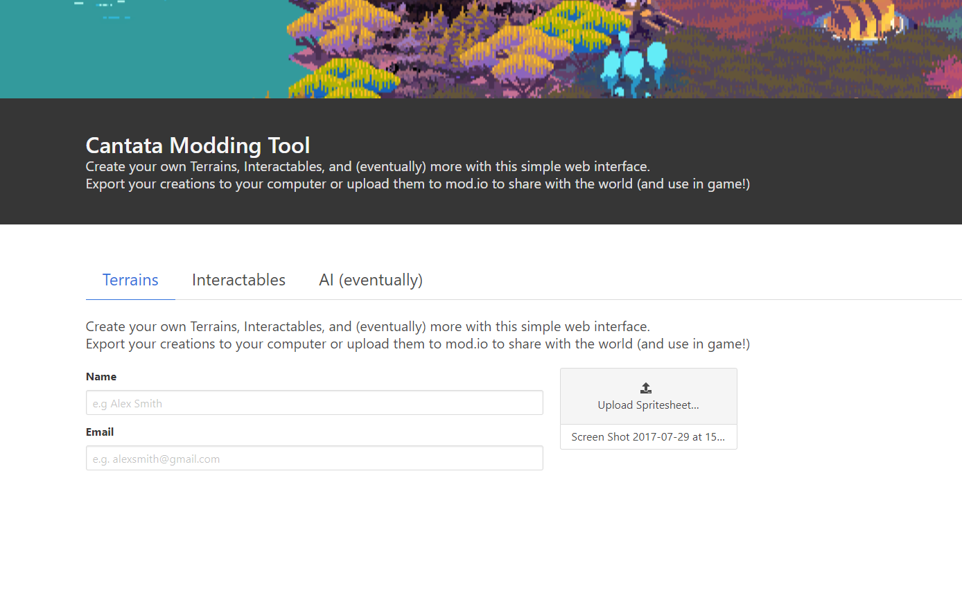
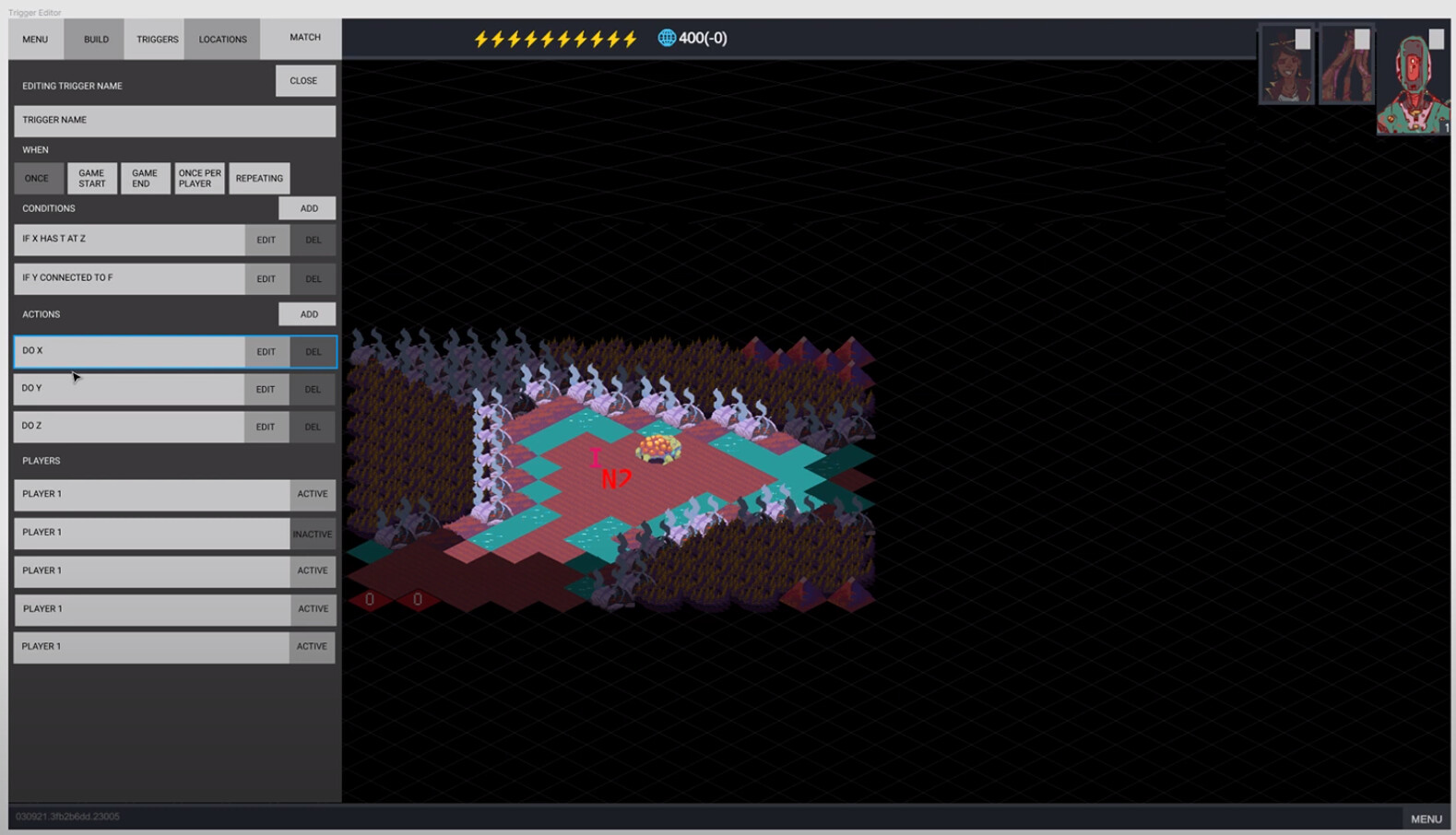
Yeah I was surprised by how the little symbol really gave so much! Also I was surprised to see that the way I implemented it gave me the chevron preview on movement preview as well!

I definitely think there is some UX to be done around preview tile colors, but for now I’ve got them this way so they are at least somewhat unmistakable. It would be pretty easy to add an option to change the colors from the game settings, so I may do that. As for the black tiles, I’m definitely digging them being totally blacked out until you explore them. I think that really encourages the sense of discovery on the map, vs. being able to easily see everything.

That said, I am looking into some way to do a nice grid outline of undiscovered tiles, but I’m unsure what route to take yet.

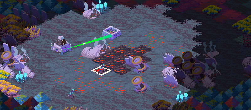
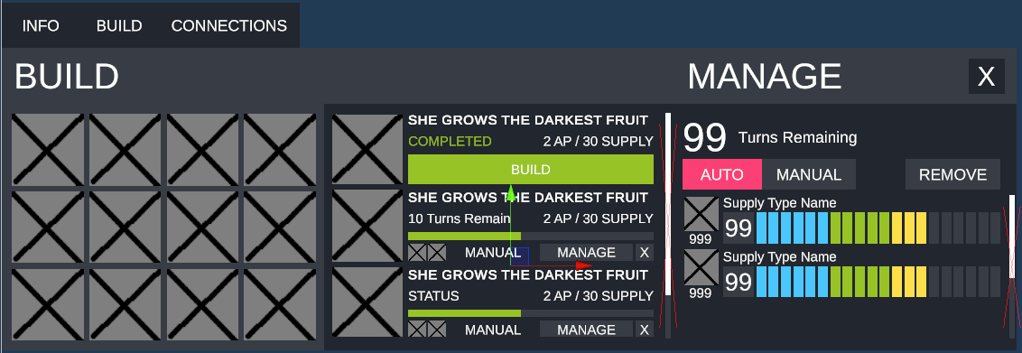
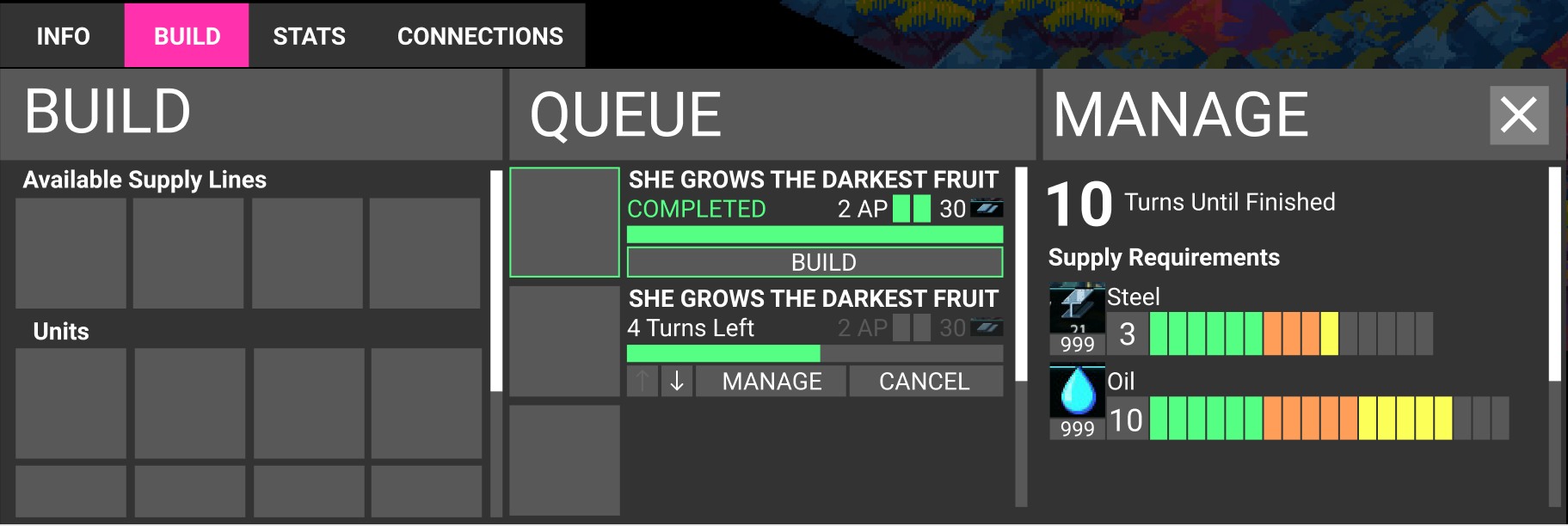
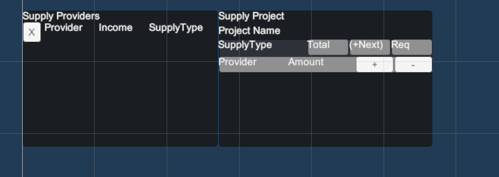
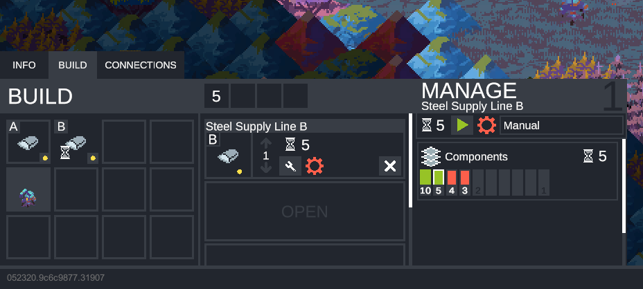
Also! Been working on some (boring) backend supply stuff! Biggest thing was fixing a bug where supply was only pulling from interactables connected to base nodes, but then also fixing a lot of weird states that crop up when you start reaching the end of your supply alotment. So implementing that looks like this:

endsupply

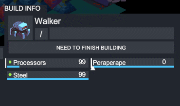
What you’re seeing there is that I’m very low on supply, so as I allocate more supply for a given requirement, the pink line comes on to indicate where I can no longer supply past. If you watch closely you can discern that I essentially have 11 supply left, and no matter how I split it between two providers I can only ever give that amount.

Another thing I fixed here was that you could over-allocate supply to a requirement if that requirement had two providers. Meaning if one provider was able to supply to fulfill a requirement of 10, but I had another provider that could also give supply, I was able to give the supply project 10 + however much the second provider could give, which is bad! But it should now be fixed!

1 Like

Starting to work on the modding tool!

Additionally, working on implementing some fixes based on early alpha feedback!

Looks good! You’re keeping that brutalist UI look going.

I’m always impressed by how forward thinking some of your design choices are. Having the AI tab in now will probably help slot it in later, and fits with how you’ve approached the editor, data storage, etc. Keep chugging!

1 Like

Thanks! A big part of this game is trying to break down assumptions about strategy/4X in general, so I’m definitely glad that comes through in terms of the design choices you’re noticing :slight_smile:

1 Like

Posted this this past screenshot saturday, but working a bit on having nicer on-map visualizations of unit state. This little lighting bolt (for now) means that a building needs to be connected to the supply network!

Similar to the last post, focusing on making the map more readable at a glance! Added in the idea of “mini UIs” that allow you to quickly see the state of things on screen. You can hold a button to preview an Interactable’s health, supply project statuses, and what actions they can perform:

Wow didn’t realize it had been since August since I posted in here! Here’s some other tile outline stuff I was working on (for more background check out this post here).

so attack ranges now are colored tiles, blue outline is move range, yellow is vision. once you select you can preview upcoming with that white line. also everything just works on hover now!

im in the process of changing over some interaction stuff right now as well, hence all the lines and such. up next is simpler interaction scheme where you can just click the map after selecting a unit to move.

Working on better indicating what supply is available when placing buildings. Pulling ideas from how Civ displays resource icons.

Right now you see icons on the map where you can recieve a supply line of that type. The purple range around your building is the range in which you can give someone supply of the types you can give.

Will probably make it so buildings you can give supply to are more obvious as well, likely with a semi-transparent icon on them that lights up when you’re connected.

Had a pretty great talk with another team member recently about some changes that need to happen for supply projects, which ended up cascading into a whole host of other changes. These changes were tightly coupled to the current UI implementation, which means I took the opportunity to seriously clean up the UI (like, rewrite it from scratch clean up). I’ve got so much to talk about for the next devlog video, but in the meantime, here’s some preview of some of the UI stuff I’ve been working on.

Also, I found a screenshot of the OG UI from a few years ago! How far we’ve come…

Lots of the UI is now in game and mostly linked up! Still trying to get over the hump and finish it up but lots of it is in, working, and attached to real data.

Working on an actual new feature as part of the UI/UX overhaul: a build queue!

Some more peeks at the new UI - it’s so close to being done!

Going to have a new developer video out soon that goes over all of this after the long journey, so thanks to everyone that has been patiently waiting!

Some video previewing stuff in development! New dev video imminent!

Wow been a minute since I posted here…

Anyways working on some new UI for… STORAGE!

panelanim

Planning on talking way more about this in the next development video.

scenario editor re-design peek

Some more scenario editing redesigns! One fun outcome of this is realizing the power of the modding tools. We don’t really need a notion of a “faction” anymore - players have what they can build declared directly in the editor, meaning what a “faction” emphasized text is totally up to the scenatio designer.